If your office fells uninspiring, a colour makeover might be just the thing to elevate productivity and morale. Studies in colour psychology reveal that our surroundings can influence mood, focus and performance – making colour choice a powerful tool in designing an effective workplace.
So, what is colour theory?
Colour theory in design explores how different colours interact and harmonise to evoke emptions and convey messages. At its core are primary (red, blue, yellow), secondary (green, orange, purple) and tertiary colours, arranged on the colour wheel to guide your choices to create harmony, contrast or balance.
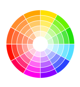
Complementary colours (positioned opposite each other) create high contrast, whereas analogous colours (positioned next to each other) create a sense of harmony.
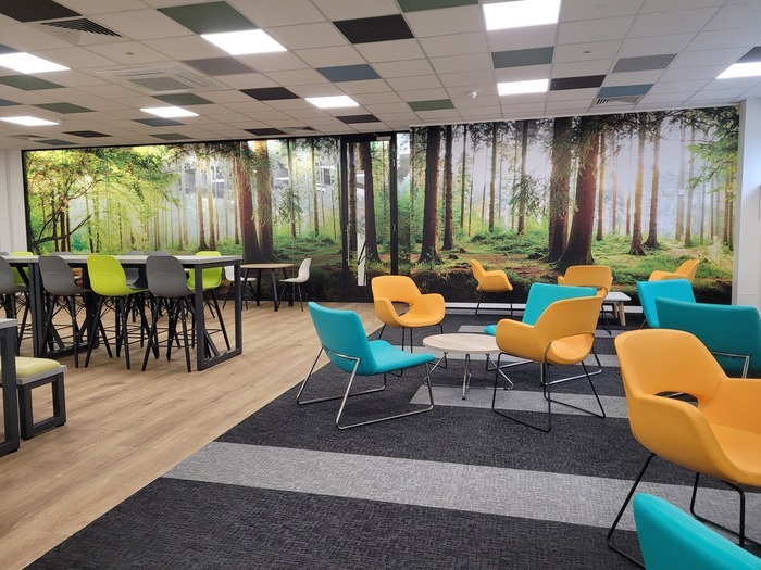
Colour appendix
Hues: The purest form of a colour. In other words the colour without any added black or white.
Saturation: the intensity or purity of a colour. High saturation – vibrant/ Low saturation –muted
Value: How light or dark a colour is, relevant when creating contrasts, depth or dimension.
How colour impacts mood and behaviour
Colour psychology studies the emotional and behavioural responses to colour, helping designers tailor spaces to meet different workplace needs.
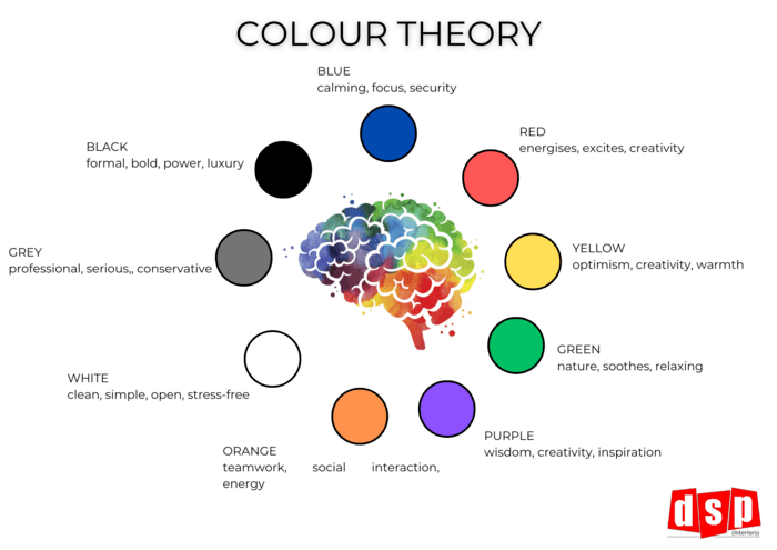
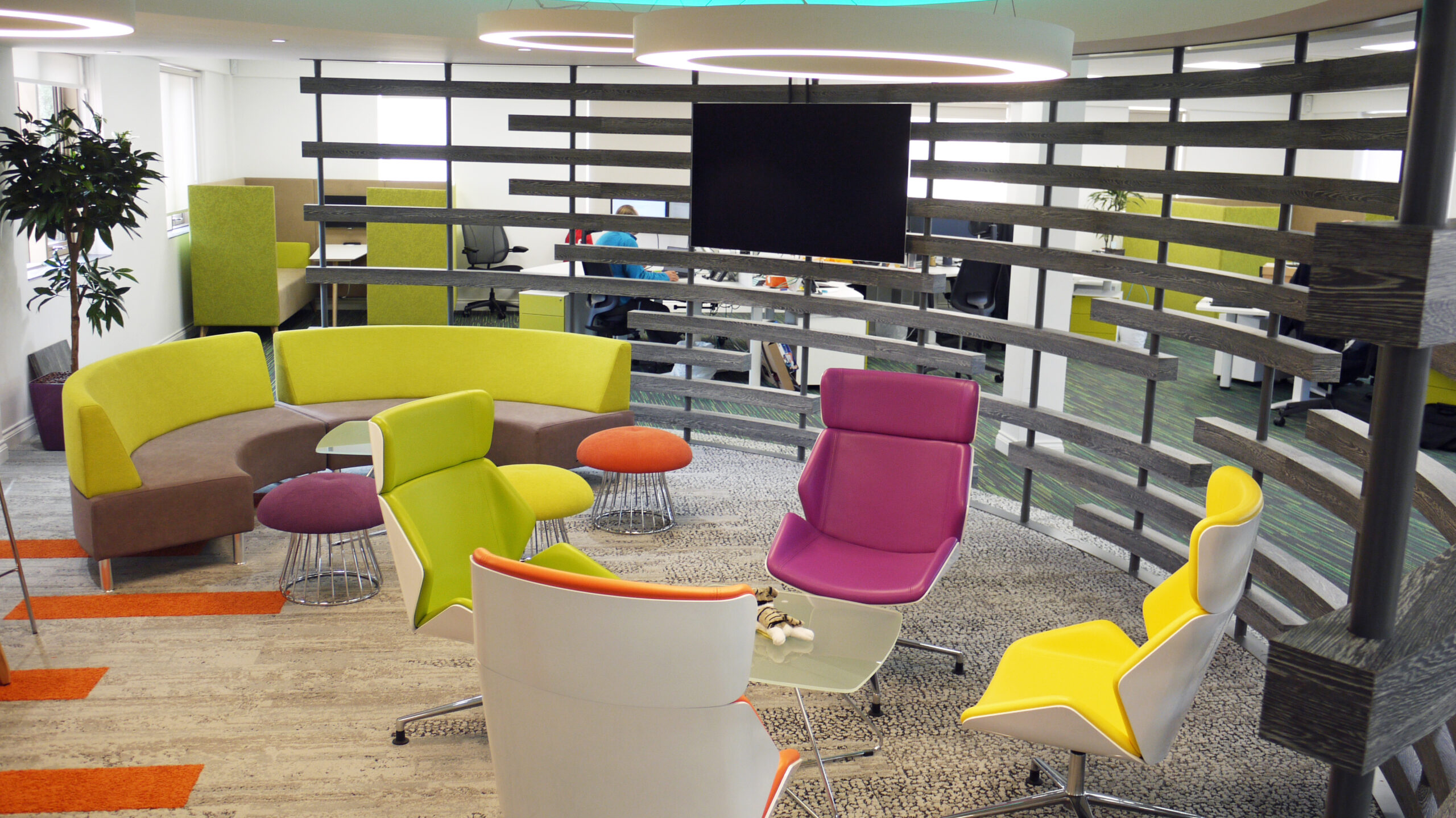
Blue: Known for its calming, focusing effects, blue can enhance concentration in offices and meeting rooms, promoting productive discussions
Red: This bold colour energises, inspiring excitement and creativity. The overuse of the colour can be overwhelming and increase stress levels, but in moderation it encourages brainstorming and dynamic discussions.
Yellow: Linked to optimism and creativity, yellow can add warmth to collaborative spaces, though its best in moderation
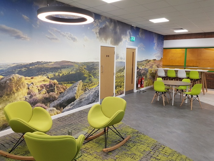
Green: Reminiscent of nature, green soothes and reduces eye strain, making it ideal for both workstations and relaxation areas.
Purple: symbolising wisdom and creativity, purple sparks inspiration and is perfect for creative departments
Orange: With its vibrant energy, orange promotes teamwork and social interaction, ideal for training or group areas
White: Clean and simple, white makes spaces feel open and stress-free but should be balances with other colours to avoid a sterile feel.
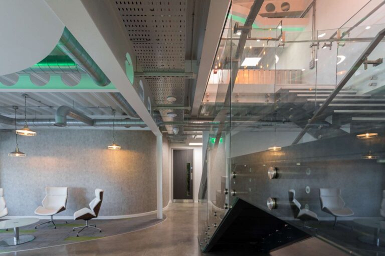
Grey: While professional, grey can feel dull if overused, so its best accented with livelier colours.
Black: Formal and bold, black is impactful in small doses, particularly for accenting high-end professional settings
Tips for effective colour implementation
- Match colours to activities: Calming hues suit focused workspaces: vibrant shades work well in collaborative areas
- Balance and contrast: Create visual interest without overwhelming the senses – accent colours should highlight key areas, not distract
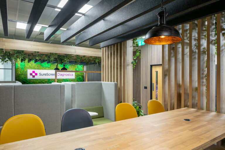
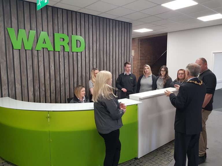
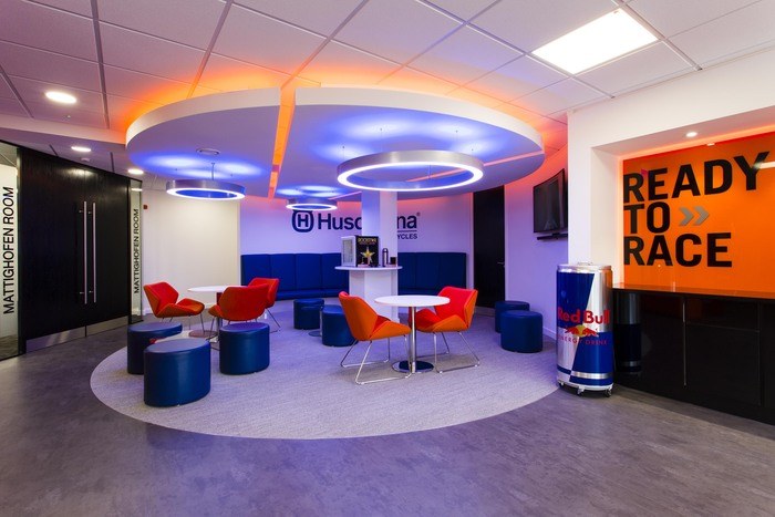
- Incorporate branding: Using your brand colours in the office reinforces company identity while unifying the design
- Use natural light: colours look best in natural light, so maximise it to enhance the workspace’s welcoming feel
- Encourage personalisation: Letting employees add personal touches makes for a more comfortable and engaging space
Using colour theory for wayfinding and accessibility
Colour isn’t just about aesthetics: it’s a practical tool for navigation and accessibility in the workplace. Using distinct colours to differentiate departments or areas can make large spaces easier to navigate, especially for those with cognitive impairments.
Key approaches include:
- Colour coding: visual coding makes spaces more recognisable and reduces the mental loads of navigating complex environments
- High contrast: clear contrast between walls, floors and doors creates a better visual separation, aiding depth perception and ensuring key features stand out
- Wayfinding symbols and signage: colours paired with symbols can help reinforce directions. Consistent colour-coded signage can assist individuals to identify
- Soothing colours: Soft hues can create calming environments and reduce anxiety
With these principles, colour becomes a more supporting tool, making workspaces not only more intuitive but more inclusive for all.
Make colour work for you
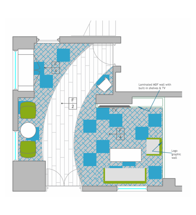
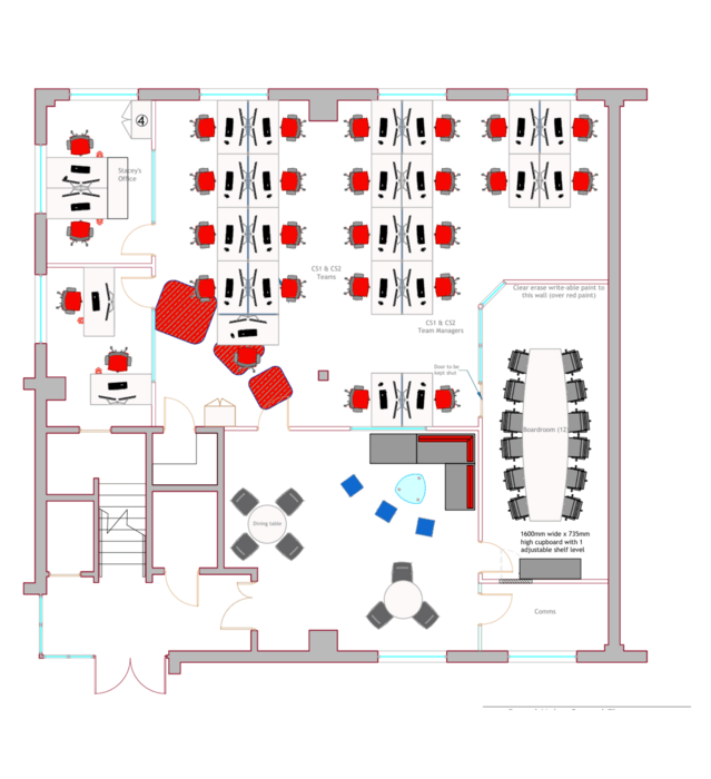
The strategic use of colour can turn your workspace into a supportive, motivating environment. At DSP (Interiors), we specialise in designing spaces that not only look great but also boost productivity and well-being.
Contact us at sales@dsp-solutions.co.uk or 01332291618 to discover how we can help transform your office


